Avoid Event Slides crop
Hello!
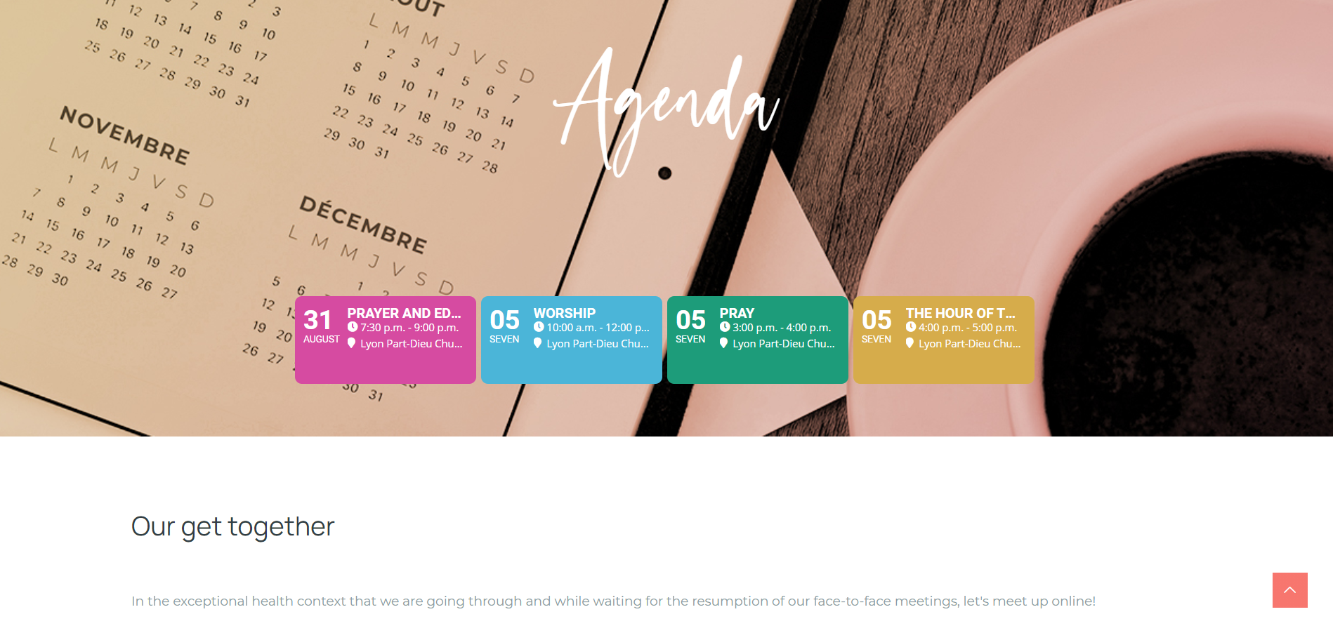
A question about Event Slider : we would like to avoid have any slides cropped with events centered on remaining space.
Can you check for that ?
Thank you!
Guillaume
-
-
Aug 30,2021 AT 11:26AM -
Posted 5 years ago
- #250314
Hello,
Please add this CSS code to EventON > Styles (If you don’t see any change, EventON > Scripts & Styling > turn off Write styles to header > save settings > turn on Write styles to header):
.evoslider .eventon_events_list { align-items: center; justify-content: center; width: 100% !important; }

-
Aug 30,2021 AT 1:00PM -
Posted 5 years ago
- #250346
Thank you the events are well centered now ! 🙂
However we will want to avoid displaying cropped events as you can see on the joined screenshot. We wil rather having only two events displayed fully and others accessible through arrows…
Could you add this functionality please !?
Thanks again,
Guillaume

-
Aug 30,2021 AT 11:45PM -
Posted 5 years ago
- #250409
Hello Guillaume,
They only appear that way because you have opened the site customization panel. They do not appear cropped for everyone else.
-
Aug 31,2021 AT 1:45AM -
Posted 5 years ago
- #250430
Hello Kenneth,
Thank you for your answer.
Fact is that its cropped even on mobile phone you Can check it on this screenshot took on Android furthermore on my mobile running chromé thé slider doesn’t slides automatically as it do on desktop having reduced Windows size.
I will five you credentials if you want to check for that for its not working as it should right now…
Best regards,
Guillaume

-
Aug 31,2021 AT 2:38AM -
Posted 5 years ago
- #250446
Please remove the previous code and then add this one instead:
@media only screen and (min-width: 960px) { .evoslider .eventon_events_list { align-items: center; justify-content: center; width: 100% !important; } }
-
Sep 1,2021 AT 3:53AM -
Posted 5 years ago
- #250699
Thank you for your messages, I am going to assign this ticket to Ashan and he will be able to take it from here and find you a solution. Please allow some time for him to get back to you, we greatly appreciate your patience and thank you for being a eventon customer! Also please disable any IP blocking on your site if there are any.
…as it should and dragging right to left or left to right doesn’t do nothing.
Do you have similar issue with actual mobile?
-
Sep 1,2021 AT 3:19PM -
Posted 5 years ago
- #250766
Hello !
Thank you to take charge of the matter !
I confirm you that the problem appears also on mobile, you can see on the screenshot a vertical line as beginning of another event box right to the one fully displayed.
Good luck

-
Sep 6,2021 AT 3:10PM -
Posted 5 years ago
- #251106
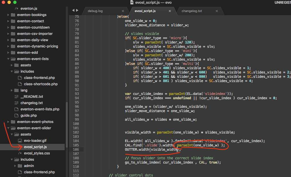
please try this patch fix and see
-
Sep 7,2021 AT 3:11AM -
Posted 5 years ago
- #251140
Hello and thank you Ashan ! It works 🙂
However it remains a problem that I noticed on desktop and mobile phone : its about resizing the window / rotating the mobile… In these cases very often there are events cropped at left and right of the slider as you can see on the linked screenshot.
Thank you again !!
Guillaume
-
Sep 9,2021 AT 4:33PM -
Posted 4 years ago
- #251403
I am not able to replicate this on your website. Are you seeing this on desktop as well?
-
Sep 9,2021 AT 11:52PM -
Posted 4 years ago
- #251414
hello Ashan,
I just checked again on desktop it appears through the average window width of 1032px while resizing window. I join you a capture I just took. Resizing screen taller to smaller or smaller to taller at this average screen size point made the bug appears.
I think this could happen on Tablet too but haven’t check.
Thank you again

-
Sep 13,2021 AT 1:08PM -
Posted 4 years ago
- #251643
HEy,
I am not sure I understand the point here.
Is this related to us, or how you use this on your web site?
-
Sep 14,2021 AT 1:46PM -
Posted 4 years ago
- #251748
Hello!
The point is that on particular screens width events box on left and right are cropped and the slider is off so we can’t see them in full. Normally in this case only three events should be shown and the other being accesible by arrows or dragging. Got it ?
Yes its related to you I just dropped the shortcode as this to get this behavior. Moreover I yet gave your team credentials to access admin of our website so you can check all that by yourself…
Thanks!
-
Sep 14,2021 AT 7:47PM -
Posted 4 years ago
- #251755
SEE VIDEO BELOW
fort us the issue can only be duplicated by playing around with the size which is something only a web developer does.
-
Sep 21,2021 AT 4:05PM -
Posted 4 years ago
- #252347
I understand the issue at certain pixel res. We will check into this further in the next update for slider addon. It is a serious issue to have to see half cropped slides. Greatly appreciate you sharing this info with use!!
-
Sep 22,2021 AT 9:08AM -
Posted 4 years ago
- #252421
Thank you Ashan ! Very glad to hear about that! I hope you can figure out the problem soon.
Our website is not officially launched and the calendar is one of the point we need to adjust before releasing it officially.
Best regards,
Guillaume
-
Sep 24,2021 AT 4:24AM -
Posted 4 years ago
- #252601
Most welcome Guilaume and we appreciate all your kind words also
-
Aug 30,2021 AT 11:26AM -
Posted 5 years ago
- #250314