Thank you for your messages, I am going to assign this ticket to Ashan and he will be able to take it from here and find you a solution. Please allow some time for him to get back to you, we greatly appreciate your patience and thank you for being a eventon customer! Also please disable any IP blocking on your site if there are any.
while you wait for Ashan
Could you please try the instructions mentioned in this documentation to make sure your issue is indeed coming from eventon. see if there is another plugin that is causing an issue especially those other woocommerce plugins you have (Not saying they are causing a conflict but would be good to eliminate them when diagnosing)
So i removed the css I added as it was stuffing up the single event page- pushing the singel event over the side bar
here it is if we need it again
@media only screen and (max-width: 425px) {
.ajde_evcal_calendar {
padding-left: 2% !important;
padding-right: 2% !important;
}
}
@media only screen and (min-width: 426px) {
.ajde_evcal_calendar {
padding-left: 10%;
padding-right: 10%;
}
}
see video below perhaps that might ?????? help?
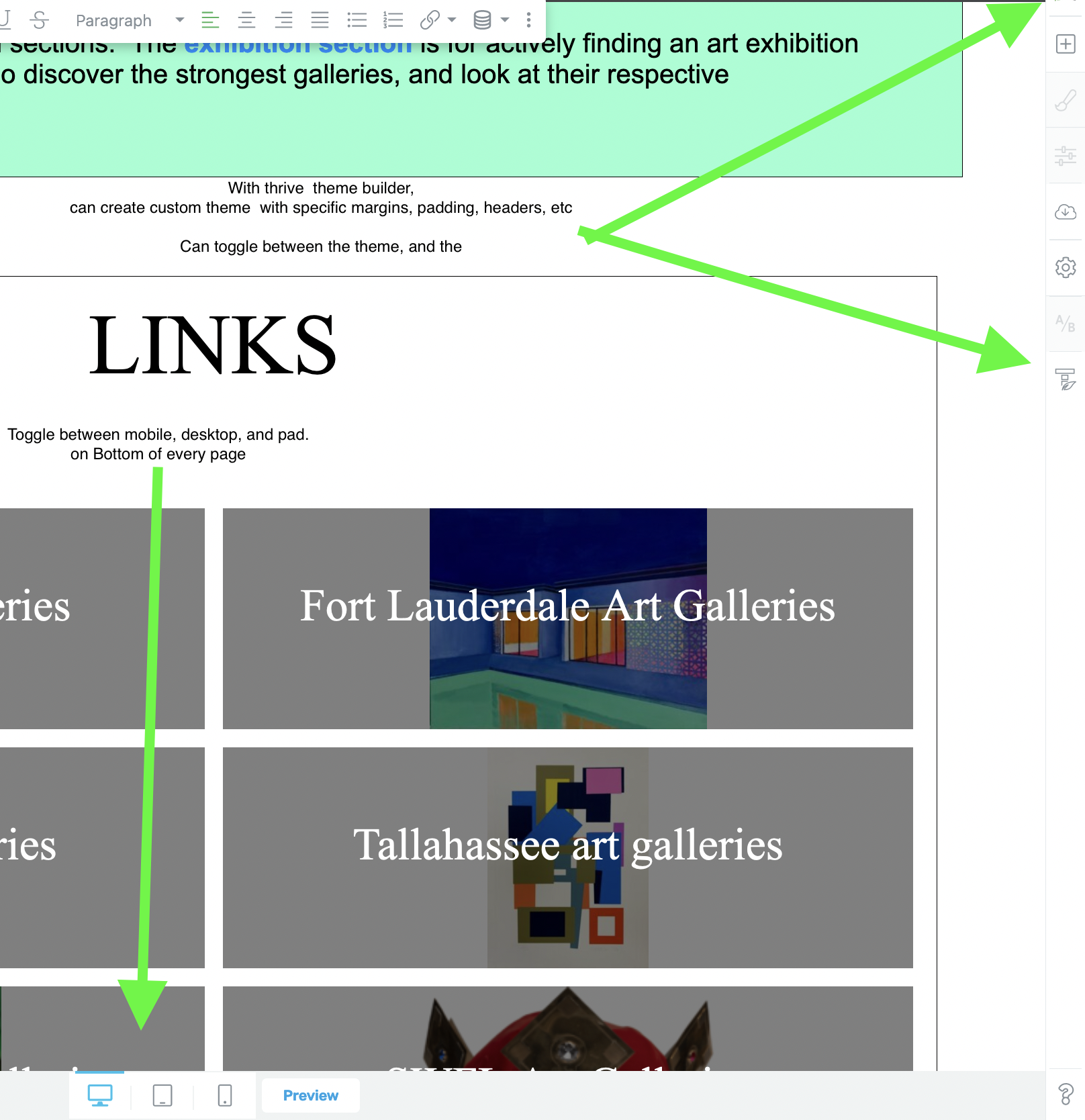
Editor controls, if you were looking for this. I didnt realize those pages created by eventon were using the theme from my site builder.
—
It seems Google is liking Eventon. my search console seems to show multiple updates per day, and my growth is increasing, thanks to eventon!!!
also they may wish to remove
show_et_ft_img=”yes”
from their calendar
I don’t see the slider plugin on the home page
Thank you so much Dave!!
Mobile: Im ok with full width, if necessary.
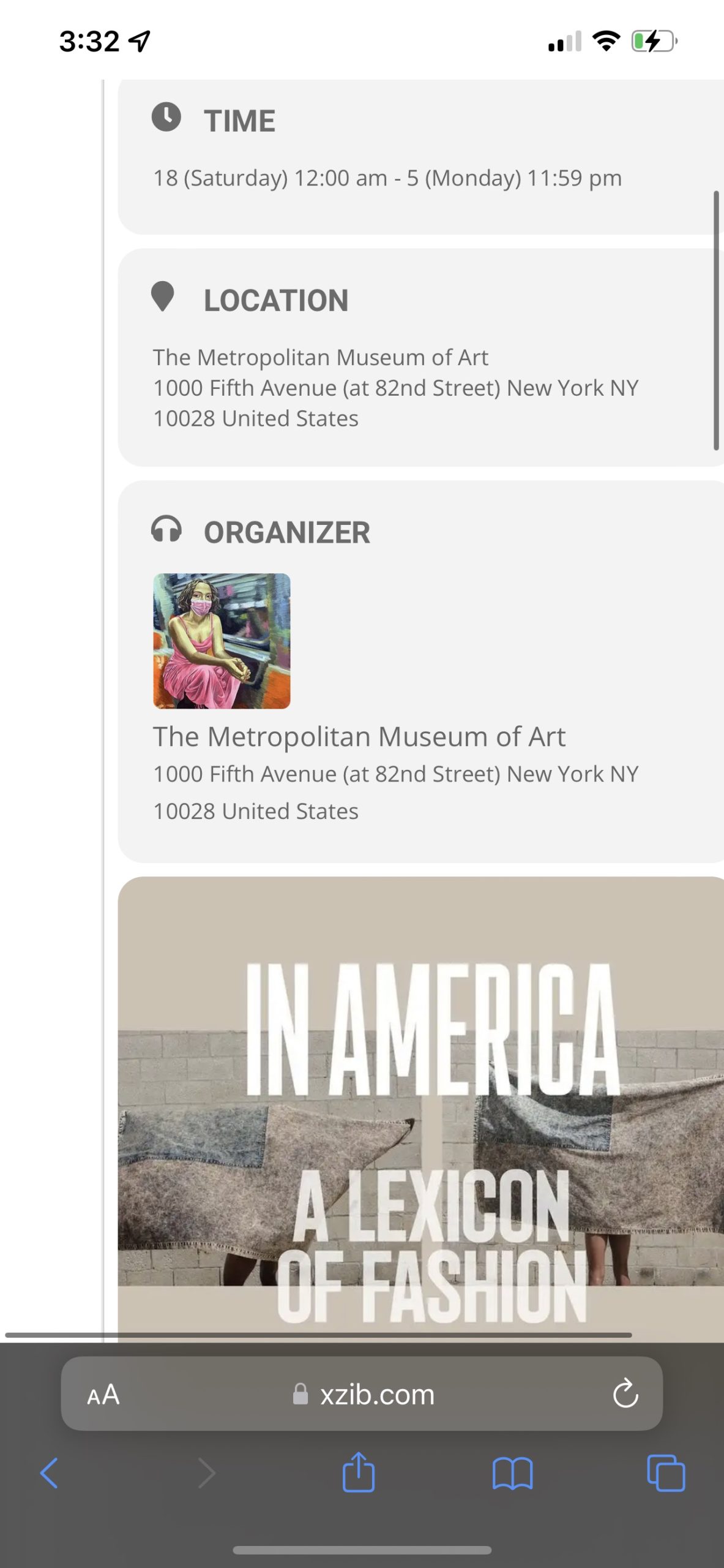
It looks to have 10% padding, my iphone(picture below). And I would prefer to keep the margins as low as possible so, so users can see the biggest images possible.
Also, when the event is opened, there is margin on eventcard. And the event card is off center, with only the padding on one side. And a horizontal slider. And Id like to avoid this if possible, Even if it means having zero margin on mobile.
It is possible that the developer I had trying to fix this did not remove some code. I can have him revisit it, if needed.
—-
On Desktop
I thought my margins were 10%. But they are 5%. And if you could keep it at the 5%, that would be ideal. So as to match with the other desktop pages. And I think the pad size is similar… I dont get many users on pad size, so its not a priority.
—
I have attached a photo of the editor. The thrive theme builder has the ability to customize theme, and apply various theme to each page. So, theoretically my site could have a diferent theme for every page. I took a photo of where you can access the desktop/pad/mobile.
Hi Michal,
Ashan will process this first hand
Hey Roger,
I have asked Ashan and pinged him to check this ticket again. We do know that he is working to push this update our together with some more cool updated things, so we do appreciate the patience!
most likely we will have to sort that issue out first